When designing a responsive website, we have to consider various breakpoints in CSS in order to optimise our websites’ viewing experience for different devices.
The latest version of the popular CSS framework for mobile, Bootstrap 4, has breakpoints as follows: if the end user’s screen is smaller than 576 pixels, show the smartphone layout. If the screen is larger than 576 pixels but smaller than 992 pixels, show the tablet layout. If the screen is larger than 992 pixels but smaller than 1200px, show the regular desktop layout, and if it is larger than 1200px, show the extra-large desktop layout.
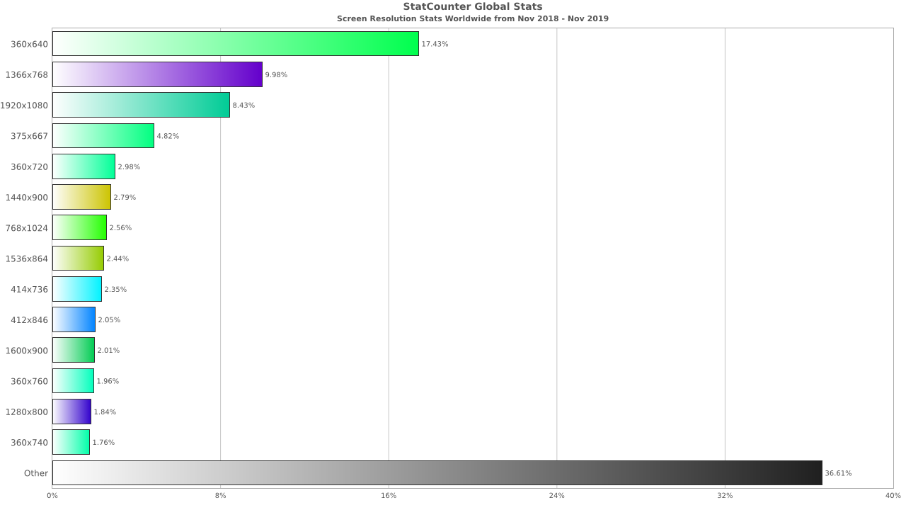
We have found out that as of 2019, the most common resolutions
are as follows:
Desktop: 1366x768 and 1920x1080
Mobile: 360x640
With this information, we find that the widths to design our breakpoints at, as recommended by Bootstrap 4, are still highly relevant. Height is secondary although we should always consider that important information remains above the fold; in other words, it can be viewed without scrolling. However, we observe that the desktop resolution of 1920x1080 is getting more popular, and hence designing for these HD screens will require visual assets of greater dimensions for sharper display.
As digital marketers, it is important that we monitor the common device resolutions as screen technology advances rapidly and the new decade could unravel new standards that our websites will have to constantly adapt to or we shall risk falling behind more agile competitors.
Explore Our Work
View our portfolio