Designing banners for mobile defers slightly from designing for desktop. We cannot reuse the same banner for both desktop and mobile platforms.
We view these devices of differing screen sizes from different distances and this affects the optimal size of the elements in the banners e.g. fonts, call-to-action (CTA) buttons and product images. As the banners are scaled proportionately according to our screen widths, a CTA button intended for a desktop banner would look too small on mobile if we reused the same banner. The same goes for fonts. Hence, it is common practice to design 2 separate banners for desktop and mobile for better user experience. Let us elaborate on designing mobile banners.
1. Font
A minimum font size of 12px is recommended for mobile banners as anything smaller than that makes it hard for your audience to make out your text. You really wouldn’t want people to be squinting at your banner. Most times, people give up and ignore your banner ad.
2. CTA buttons
Your CTA buttons have to be large enough for users to tap on. Since we tap our screens instead of
using cursors on mobile, set the height of your buttons to be larger than or equal to the height of
the average fingertip. It also helps that the CTA buttons are large enough to draw your audience’s
attention.
Real estate on mobile is scarce. Therefore, you should not design your buttons to be too big either.
This imbalance will take attention away from the more important messages of your ad and reduce its
overall effectiveness.
3. Common media banner sizes
When designing for media ads, there are a few important media banner sizes to remember are they are
the top-performing dimensions, according to Google.
300×250 – Medium rectangle
Usually displayed between text content on partner sites, these ads seemingly appear as native
content, or content that is highly similar to the look, feel and context of the hosting
website.
728×90 – Leaderboard
The leaderboard banner usually shows up on the top of the page, and is used to maximise impressions
from audiences.
300×600 – Half page or large skyscraper and 160x600 – Wide skyscraper
The large skyscraper is one of the largest media banner sizes available; this banner makes your ad
impossible to miss and is fantastic for grabbing attention with great visuals. On the other hand,
the wide skyscraper is less intrusive to native content on the hosting webpage while retaining its
visibility. It is important to consider your banner design due to the extreme vertical ratio of its
dimensions. You definitely don’t want to be paying to display empty areas in your banner if your
visuals are not suitable for such vertical banners.
320×50 – Mobile leaderboard
This size is optimised for smartphones and should be utilised in every campaign so as to capture the
mobile users, which often make up half of your impressions.
4. Retina
The retina display was first introduced by Apple in 2010. Devices with retina displays has greater
pixel density; compared to the older smartphones, more pixels occupy the same physical space on a
retina screen. This meant that the same website, banner or icon which was designed without retina
display in mind would now look blurry.
While it revolutionised users’ mobile viewing
experiences, mobile designers had new issues to deal with. For retina displays (2x), a common
practice is to design at twice the dimensions, for example, a 100x50px button would now require a
200x100px button for sharpness on retina screens although they appear as the same physical height
and width on both older and new smartphones.
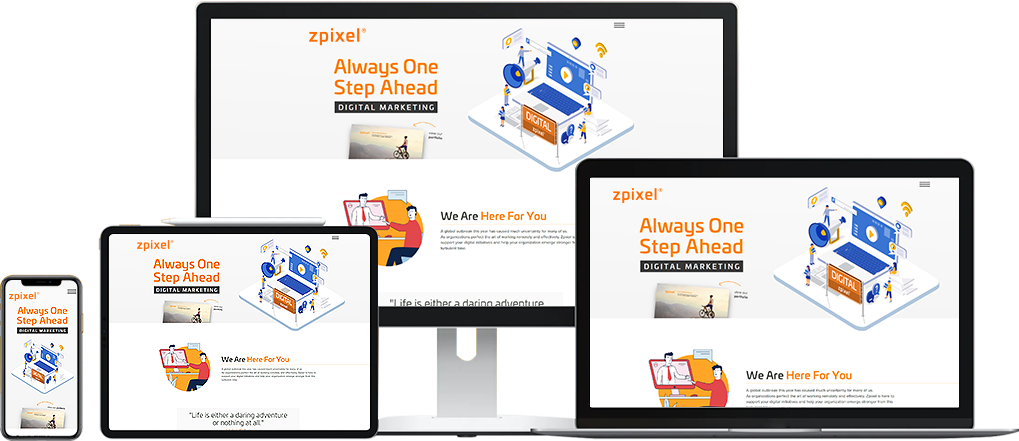
Explore Our Work
View our portfolio