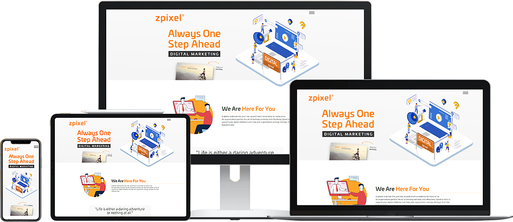
When building a website, we have to consider whether the site will be viewed on a desktop, tablet or mobile. Responsive web design (RWD) and Adaptive web design (AWD) are two distinct methods to approach this issue.
First, let us understand how the two designs work: Responsive design (RWD) alters your website layout to adapt to screens of different resolutions through breakpoints in CSS. In essence, this is a fluid design that fits itself into the container of your screen.
On the other hand, Adaptive design (AWD) displays different pre-designed pages after detecting the screen size of the device that you are using. Unlike RWD which only uses one responsive page, in AWD, we create different designs (desktop and mobile) of the same page. During display, the browser detects the screen width and shows only the most suitable design.
There are strengths to both approaches as follows:
RWD
1. As this is a single fluid design that fits seamlessly for any screen resolution, RWD sites offers consistency across all devices and are stronger for branding.
2. Low cost of maintenance as changes only have to be administered once. AWD requires changes to be made for desktop, tablet or mobile versions respectively.
3. Since a single URL is shared regardless of desktop, tablet or mobile devices, RWD enables your SEO strategy to be much more effective than AWD sites which have distinct URLs.
Enter Points. A point is an abstract form of measurement for iOS devices, referred to as DIP (Density Independent Pixels) on Android. With points, designers simply design a banner at 200 points tall, and the multiply it by the pixel density of the device it is being displayed on i.e. banner dimension of 200px on 1x and 400px on 2x.
AWD
1. Designing and developing your site will be time-efficient as it only exists in 2 specific states namely, desktop and mobile versions.
2. Ease of testing on the specific states as it is straightforward compared to the effort required to create a single RWD design that has to be stringently tested and troubleshot to display properly across different resolutions.
3. As a result of a more stable and controlled implementation, AWD is more cost-effective than RWD development.
However, for best practices, RWD is the way to go as it brings out greater long-term benefits in the larger context of branding as it allows for greater consistency for your users as they engage with the same site across different viewing devices.
RWD allows for easy updating and SEO optimization once you get through the more tedious initial setup.
If it is simply a temporary landing page to promote your new product or event, AWD is going to save you a lot of time and cost without having to worry about long-term maintenance issues and should be one of the few occasions you turn to AWD.
Explore Our Work
View our portfolio